Brand
Guidelines
The visual and verbal system of a maison founded in 1947 — a house that does not follow fashion, and dresses what endures.
Ateliers Paris & Florence
Online maison · Ressemblance FZCO, Dubaï
Issued by the Studio
Alexandre Joude · Directeur Artistique
How to read this book
A brand book is not a rulebook. It is the memory of a house, written down so that every hand that touches the maison touches it the same way.
Ressemblance is a small house with a long memory. Since 1947 it has been built by no more than a few dozen hands at a time — and yet its name now travels through screens, couriers, ateliers and partners across three continents.
This document holds the maison together at that scale. It records the logotype, the emblem, the colour, the typography, the photography, the voice — and the reasoning behind each. It is written so that a new designer, a printer in Florence, an agency in Dubaï, or a developer building the next page can act as the house would act, without asking.
Everything in this book serves one idea, the same idea that gave the maison its name: a piece must resemble the person who wears it — and the brand must resemble itself, in every place it appears.
When a decision is not covered here, it should be made by returning to that idea. Restraint over noise. The hand over the machine. The thing that lasts over the thing that sells. If a choice cannot be defended by the house's values, it is not a Ressemblance choice.
02 — 05 · The maison
The story, the name, the platform and the voice. The verbal foundation — who the house is and how it speaks before it is ever seen.
06 — 14 · The system
Logotype, emblem, colour, typography, layout, photography, iconography and motion. The visual grammar — the parts that must never be improvised.
15 — 18 · In the world
Digital surfaces, physical applications, the naming of pieces, and the governance that keeps it all coherent over time.
A house with a long memory
Seventy-nine years of drawing pieces that take a patina without losing themselves. Four generations, one workshop floor, never a single piece subcontracted.
The atelier opened on a Tuesday in September 1947, on the rue de la Boétie in Paris. Three machines, two dress forms, a dozen lengths of cloth on waxed wood. Adèle Joude was twenty-nine. She had left a post at Madame Grès for a house of her own — without capital, without advertising, without any promise other than the one she made to herself.
She began with the silhouettes of women she knew: the bookseller of the rue de Lille, the pianist of the rue Saint-Honoré, her own aunt. She cut for them — without collections, without seasons, without fixed appointments. A score of faithful clients in the first year; then, by word of mouth, the number widened.
The house has never advertised. It has never subcontracted. Four generations later, every piece is still cut, mounted and finished by the maison's own hands, in Paris and — since 1984 — in Florence.
Foundation — Adèle Joude
Adèle Joude opens the atelier on the rue de la Boétie. Three machines, two dress forms. The house is built on a single criterion: that the piece must resemble the woman who wears it.
The first collection
The maison moves from made-to-measure to collection. Twenty-four pieces presented — still cut entirely in-house, still without advertising.
Florence
The menswear couture atelier opens in a Florentine courtyard. The second workshop floor of the house — and the beginning of its Italian cloth relationships.
The third generation — Marc-Antoine Joude
Marc-Antoine Joude takes the house and keeps the whole of production internal. Not one piece leaves the maison untouched by its own artisans.
The fourth generation — Alexandre Joude
Alexandre Joude takes the artistic direction of the house. The maison becomes an online house — its boutiques replaced by a concierge, a courier, and a screen — without loosening a single thread of the atelier.
Été 26 · Le Caire
The first Egypt collection. Forty-three numbered pieces, a single limited drop — the motifs of the temples of Karnak, the light of the Nile, the lapis blue of the frescoes of Abydos.
Ressemblance
The name does not come from a desire to imitate. It comes from a word Adèle Joude used without end: the piece must resemble you.
In French, ressemblance means resemblance, likeness — but never imitation. Adèle Joude did not want her clients to look like a season, a runway or each other. She wanted each piece to resemble the person it was cut for: their carriage, their hours, their restraint.
This is the whole house in one word. It is why the maison numbers its pieces and signs their cards of origin. It is why it offers lifetime alterations — so the piece can keep resembling its owner as the owner changes.
| Full form | Ressemblance — used everywhere as the primary name. |
| With descriptor | Ressemblance, maison fondée en 1947 — for first mentions, press, formal documents. |
| Never | No abbreviation. No "Ress." No acronym. No translation of the name. |
| Spoken | French pronunciation is preserved in every market: reh-sahm-blahnce. |
| Legal entity | Ressemblance FZCO, Dubaï — used only in legal and corporate contexts, never in client-facing communication. |
“It must resemble you. That is the only criterion.”Adèle Joude · Journal de l'atelier · 1951
What the house stands on
A mission, a positioning, and four promises kept since 1947 — without advertising, without dilution.
To dress what endures — pieces that take a patina without losing themselves, cut by the hand and made to resemble the person who wears them.
An online maison of couture and ready-to-wear, operating without boutiques and without advertising. Ressemblance occupies the rarest position in luxury: scarcity by conviction, not by marketing. Numbered pieces, internal production, a dedicated concierge, lifetime alteration. The house competes not on visibility but on permanence.
Traced cloth
Every metre traced to its mill. Silk from Côme, wool from Quaregna, sea-island cotton, linen from Normandy. No blend, no substitution, ever.
Expert hands
Thirty-two artisans in Paris and Florence. No subcontracting, no compromise. Nine pairs of hands touch a single dress.
Living in time
A piece of the house takes a patina without losing itself. Lifetime alteration is offered on every purchase — the piece follows its owner.
Private service
A dedicated concierge, reachable seven days a week. No advertising, no noise — the house is found, not shown.
Restraint
The house never raises its voice. Nothing is shouted, nothing is oversold. Confidence is shown by what is left out.
Patience
A piece waits three days before its final inspection. The brand moves at the speed of the atelier, not the feed.
Lineage
Four generations, the same workshop floor. The house speaks of time as an inheritance, not a constraint.
How the house speaks
Literary, restrained, precise. The house writes the way it cuts — twice measured, never once.
Plain & exact
Short sentences. Concrete nouns. The house names the cloth, the mill, the hours — never "luxury", never "premium".
Literary, not loud
A measured, almost diaristic register. The house may use an italic line of lede; it never uses an exclamation mark.
Evidence, not adjectives
Persuasion comes from fact: "three hundred hours of hand embroidery", not "exquisitely crafted".
Quietly certain
The house states; it does not sell. It never asks twice, never pressures, never counts down with urgency.
“Seventy-nine pieces, cut in our ateliers in Paris and Florence, photographed on the banks of the Nile.”
“Discover our stunning new must-have summer collection — shop the drop now before it's gone!”
“A piece does not hold by its cut — it holds by the hours no one sees.”
“Our pieces are crafted with unparalleled attention to detail by world-class artisans.”
“Lifetime alteration, offered on every piece. The garment follows you.”
“Enjoy FREE lifetime alterations — an exclusive perk just for you!”
Use
- maison, house, atelier, workshop
- cloth, cut, mounted, finished
- numbered, signed, card of origin
- patina, endure, hold, last
- concierge, courier, alteration
- the hand, the hours, the studio
Avoid
- luxury, premium, high-end, exclusive
- must-have, iconic, game-changing
- shop now, buy now, limited time
- stunning, gorgeous, amazing
- curated, elevated, effortless
- exclamation marks, ALL CAPS urgency
| Surface | Tone | Example |
|---|---|---|
| Editorial / récit | Diaristic, literary, slow. | “The atelier opens on a Tuesday in September.” |
| Product | Precise, factual, material-first. | “100% silk ottoman. Embroidery in real gold thread, Lesage.” |
| Service & concierge | Warm, direct, certain. | “Your courier calls thirty minutes before arrival.” |
| Drop & édition | Restrained, never urgent. | “Forty-three numbered pieces. No restock.” |
| Transactional / system | Plain, reassuring, brief. | “Your pieces are held for thirty days.” |
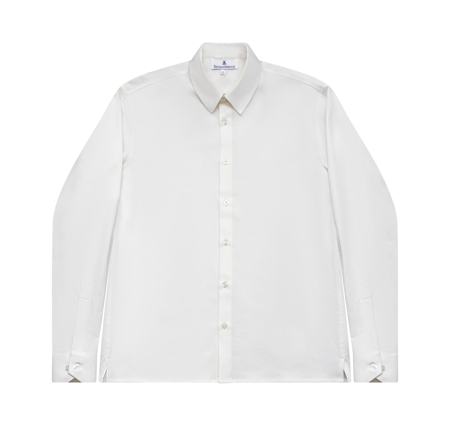
The wordmark
The name, set in Helvetica Neue Bold, in capitals, with the tracking of the house. No symbol is needed — the word carries the maison.
Primary logotype — Helvetica Neue Bold (700) · uppercase · tracking 0.02em · on warm paper
| Typeface | Helvetica Neue — weight 700 (Bold) |
| Case | All capitals, always |
| Tracking | 0.02em — the logo tracking of the system |
| Optical weight | Solid, never condensed, never extended |
| Word | One word — never broken across two lines |
The house has carried its name as its mark since 1947. The wordmark is the primary and default identity in every context — navigation, packaging, documents, signage.
The emblem (Chapter 07) is a ceremonial companion, not a replacement. The maison is never represented by the emblem alone in primary positions.
On warm paper — the default
On ink — reversed, full white
On cobalt — ceremonial, full white
The chardon art-déco
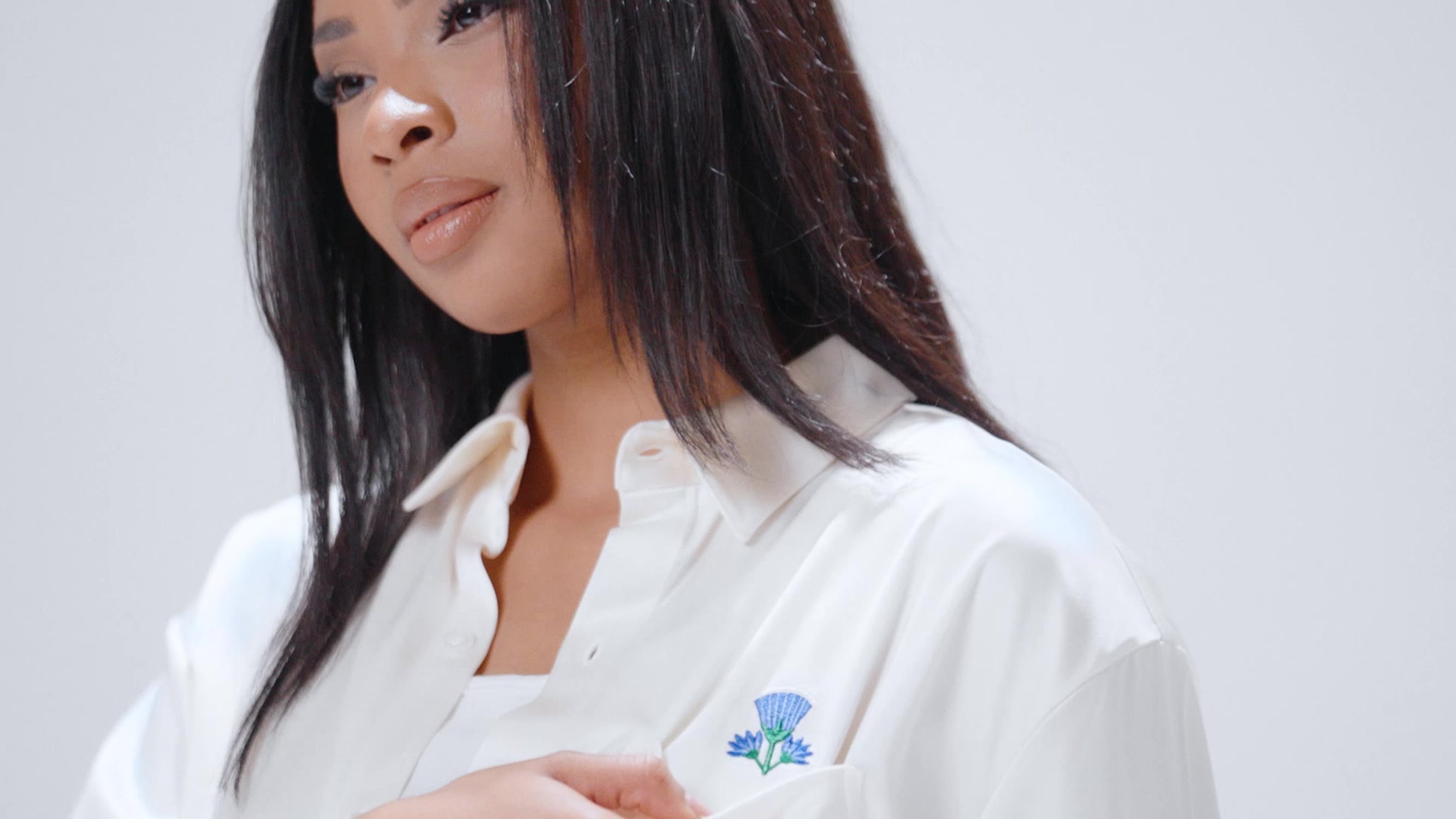
A thistle in cobalt, malachite and gold — the ceremonial sign of the house, carried by Adèle Joude's cipher.

| The bloom | An art-déco thistle fan — resilience, the flower that holds in poor ground. Cobalt petals, a white couture rim, gold rays. |
| The calyx | A malachite cup with concentric striations — the workshop, the holding hand. |
| The lotus bundles | Mirrored Egyptian lotus sprays — the Été 26 lineage and the maison's long view East. |
| The base | A teardrop in malachite carrying the maison cipher JW — the founding hand of the house. |
| The gold line | A single hairline of gold contours the whole — the thread of the atelier. |
Reserved for
- The card of origin of every numbered piece
- Packaging seals, ribbon ends and the inner box
- The signature page of the monthly carnet
- Invitations to private appointments and drops
- Foil or blind-deboss on couture documents
Never used for
- As a replacement for the wordmark in navigation
- As a repeating pattern or background texture
- Recoloured, flattened to one colour, or outlined only
- Below 28 mm / 96 px — detail is lost
- On busy photography without a solid holding field
Clear space, scale & misuse
The wordmark and emblem are protected by air, by minimum sizes, and by a short list of things that must never happen.
The protected zone around the wordmark is equal to the height of the capital R of the logotype itself, on all four sides. Nothing — no text, image, rule or edge — enters this zone.
In generous layouts, the house prefers twice this measure. The wordmark is given air the way a couture piece is given a hanger — it is never crowded.
| Wordmark · digital | 14 px cap height — navigation minimum |
| Wordmark · print | 5 mm cap height |
| Emblem · digital | 96 px height |
| Emblem · print | 28 mm height |
Digital — the wordmark is centred in the navigation bar, between menu and account. It never moves to a corner.
Print & packaging — the wordmark sits top-left or centred; the emblem, when present, sits alone, centred, with maximum air.
Co-existence — wordmark and emblem never sit locked together as one unit. They appear on separate surfaces, or separated by a full clear-space measure.
Ink, paper & cobalt
A near-monochrome house. Black, white, a warm paper — and one blue, carried since the lapis frescoes of Abydos.
RGB 10 · 10 · 10
RGB 0 · 40 · 109
RGB 244 · 242 · 238
RGB 255 · 255 · 255
Cobalt #00286D is the single chromatic signature of the maison — used for accents, links, the eyebrow, the drop, the badge. Never as a flood colour for large fields.
Cobalt Soft #0A3A8A is the only tint of cobalt — reserved for hover and pressed states on digital surfaces.
The ceremonial palette lives inside the emblem only — and on foil, ribbon, and the card of origin. It never enters digital UI, typography or layout.
The house is built of white space. Ink carries type and the occasional full-bleed field; cobalt is a punctuation mark, never a paragraph. If a layout reads as "blue", there is too much cobalt.
| Ink on Paper | 20.4 : 1 — AAA, the default pairing |
| Ink Soft on Paper | 14.1 : 1 — AAA, body copy |
| Cobalt on Paper | 11.6 : 1 — AAA, links & accents |
| Paper on Cobalt | 11.6 : 1 — AAA, reversed |
| Ink Mute on Paper | 3.4 : 1 — large text & labels only |
One typeface, five weights, five trackings
Helvetica Neue, set entirely in the house. The character of the maison is not in the letterforms — it is in the spacing.
Helvetica Neue is used exclusively. No serif, no display face, no secondary typeface — the house speaks in one voice. System fallback: Arial, then sans-serif.
| Token | Value | Applied to | Specimen |
|---|---|---|---|
| Body | 0 | Running text, lede, product copy | A piece that resembles you |
| Logo | 0.02em | The wordmark, all headings | Ressemblance |
| Button | 0.14em | Buttons, calls to action, search | Discover the collection |
| Tag | 0.22em | Labels, captions, categories | Femme · Couture |
| Monumental | 0.30em | The eyebrow — the most distinctive mark of the system | Le manifeste |
Typography — do
- Set every heading in uppercase, with the 0.02em logo tracking
- Use the italic Light 300 lede to open a section — once
- Let the eyebrow carry the most open tracking on the page
- Keep body copy to a comfortable 60–66 character measure
- Use tabular figures for prices, sizes and numbered editions
Typography — don't
- Introduce a second typeface — ever, for any reason
- Set headings in sentence case or with tight tracking
- Use Bold 700 anywhere except the logotype
- Stack multiple ledes, or use the lede as body copy
- Justify text or letter-space running body copy
The architecture of the page
A twelve-column grid, generous margins, hairline rules — and a slow vertical rhythm that lets each idea stand alone.
Twelve columns · max container 1440 px · gutter 14–24 px · outer margin 60 px on desktop. Content is never edge-to-edge except for full-bleed photography.
| Section | 140 px top & bottom — the standard breathing room |
| Section · tight | 80 px — for dense, list-led content |
| Section head | 100 px top, 60 px bottom, opened by a hairline |
| Block spacing | Multiples of 18 px — 18 / 36 / 54 / 72 |
The maison structures the page with hairline rules, not boxes or cards. A 1 px rule in Ink opens a major section; a 1 px rule in Rule (#E8E8E8) separates rows within it.
Borders are always 1 px, always square-cornered. The house does not use rounded corners, drop shadows, or filled containers in editorial layout — structure is drawn with line, not with weight.
The eyebrow — cobalt, 0.30em tracking, sits above every section title. The single most recognisable device of the system.
The numbered label — sections, pillars and services are numbered. The house counts; it does not exclaim.
The underlined link — a 1 px underline in Ink, turning cobalt on hover. The only link treatment.
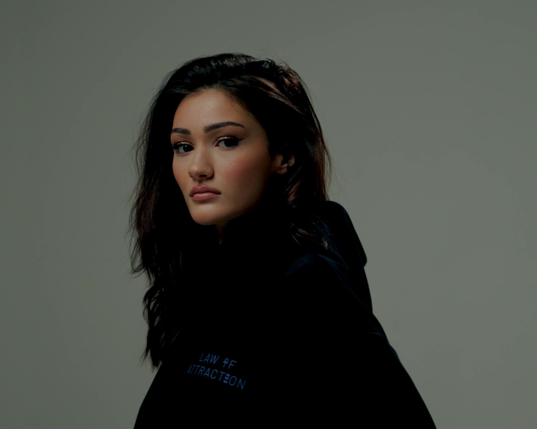
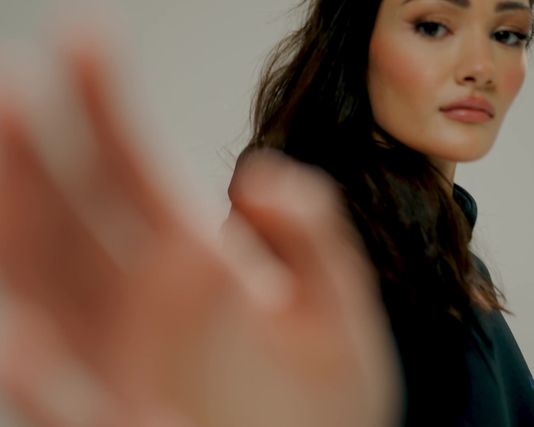
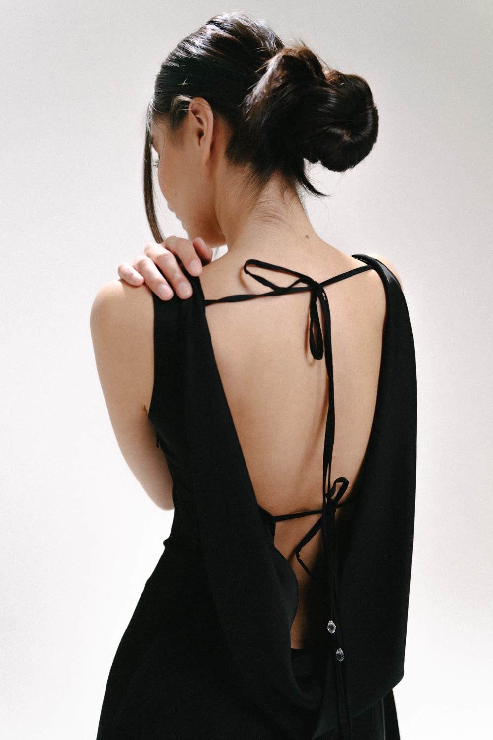
Light, cloth & the unforced gaze
Three registers — editorial, studio, product. One light: natural, low, honest. The image shows the cloth and the person, never the styling.
Editorial — the journey
Register 01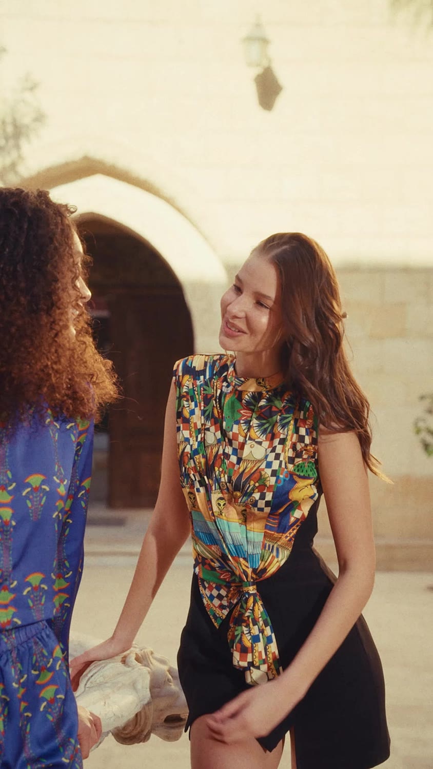
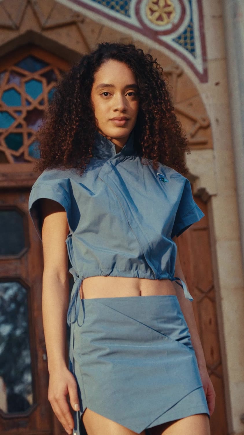
Shot on location — the collection's place, its weather, its hour. For Été 26, three weeks in Egypt: the temples of Karnak, the light of the Nile, the lapis of the Abydos frescoes. The figure moves through the place; motion blur, grain and flare are kept, not corrected. The editorial register is the récit of the house — it tells where a collection came from.
Studio — the silhouette
Register 02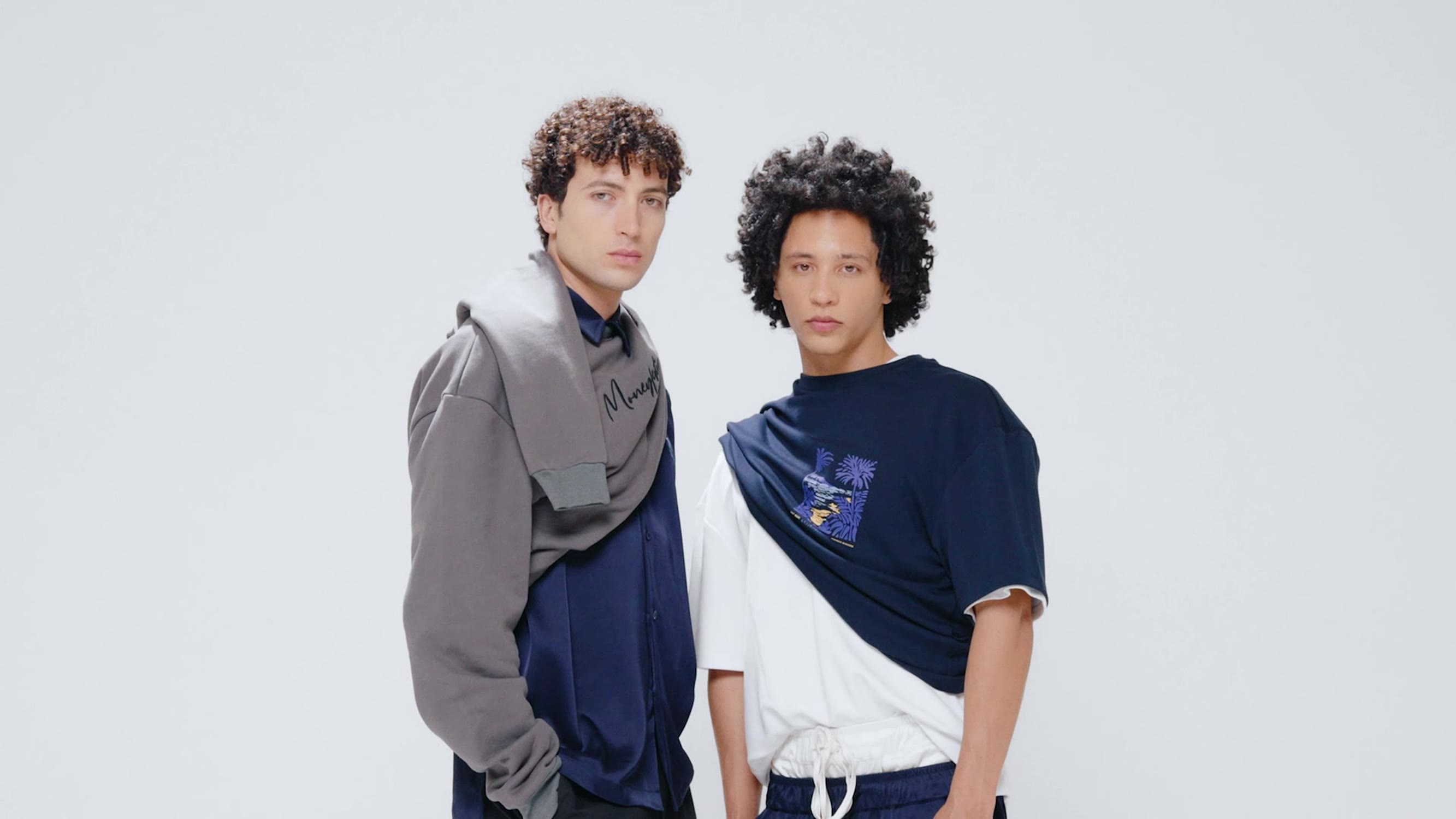
Warm seamless ground (#F4F2EE), a single soft source, the figure at rest. The studio register shows the silhouette and the cut with nothing to distract — no props, no set, no expression performed for the camera. Two figures may share the frame; they do not interact for effect. This register carries the vestiaire and the lookbook.
Product — the evidence
Register 03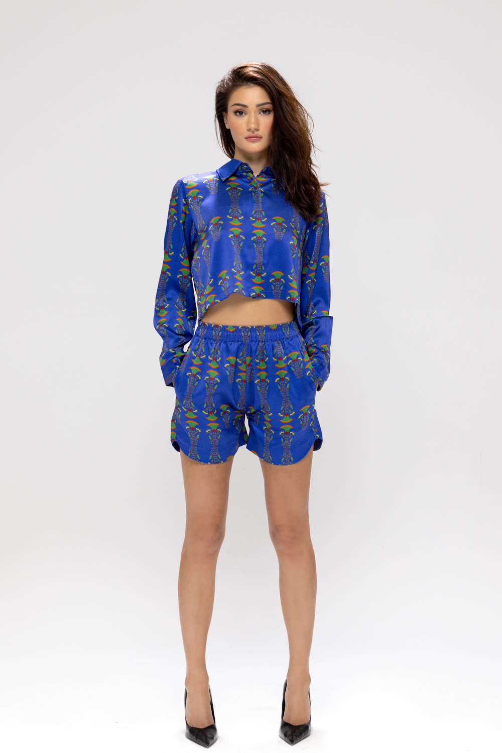
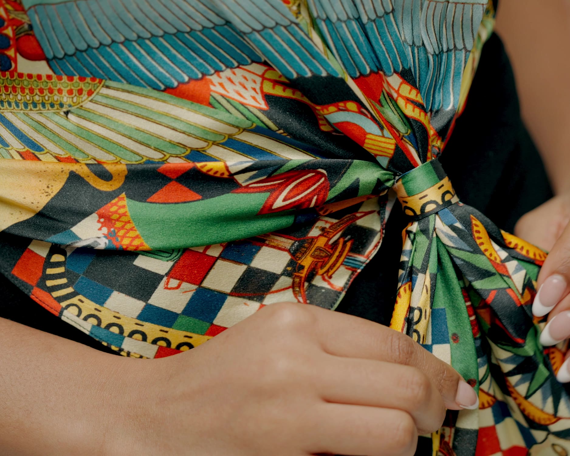
On the figure or on a clean ground, evenly lit, true to colour. The product register is evidence: the fall of the cloth, the line of the seam, the behaviour of the fabric. At least one frame per piece is a close detail — the embroidery, the selvedge, the way the fibre answers the evening light.
| Light | Natural, low, single source. No hard studio strobe in editorial. |
| Grade | Warm-neutral. Whites hold a paper warmth; blacks stay open, never crushed. |
| Grain | Kept. The image may show film texture — it is not retouched to plastic. |
| Colour | Restrained. The cobalt of the cloth is the only saturated note in frame. |
| Crop | Generous. Portrait 3:4, studio 16:9, product 2:3. The figure has room. |
Do
- Cast for carriage and presence over convention
- Let the gaze be calm, direct, or away — never performed
- Photograph hands, cloth and movement, not just faces
- Keep the place in frame — the collection's origin is the set
Don't
- Over-style — no excess accessories, no prop narrative
- Retouch skin, grain or fabric texture to perfection
- Use heavy filters, duotones or saturated colour grades
- Direct expressive, "campaign" emotion — the house is quiet
Drawn with a single line
Icons are functional, never decorative — a thin, even line, square corners, the same hand as the hairline rule.
Stroke 1.5 px · square line caps · 24 px artboard · no fill, no corner radius. Icons inherit the colour of their context — Ink by default, Cobalt on interaction.
The hairline rule — the primary structural device. 1 px, Ink for major divisions, Rule for minor.
The numbered label — "01 —", "Univers · 02", "Service · 03". The house enumerates its pieces, its pillars, its services.
The middot — a centred dot ( · ) joins related fragments: "Femme · Couture · Été 26". Never a slash, never a dash, in client copy.
The arrow — a simple "→" follows a forward link. Used sparingly, never animated.
- No illustration, no mascot, no decorative motif library
- No filled icons, no two-tone icons, no icon shadows
- No badges, ribbons or "sale" graphics — the house does not discount visually
- No emoji in any house communication
- The emblem is not an icon and never appears in an icon row
Movement at the speed of cloth
The house moves slowly and once. Motion reveals, settles, and stops — it never loops, bounces or demands attention.
Once, then still. An element fades or rises into place a single time. Nothing pulses, nothing loops, nothing waits to be noticed.
Slow in, soft out. Easing is always decelerating — the cubic-bezier (.22, 1, .36, 1). Movement arrives like a hand setting something down.
Short distances. Elements travel 6–8 px, never across the screen. The hero film is the only large motion, and it only ever scales gently in.
| Page / section in | 280 ms · fade + 6 px rise |
| Menu & overlay | 280 ms · slide-down 6 px |
| Hover transition | 200 ms · colour & border only |
| Hero film entrance | 1400 ms · opacity 0→1, scale 1.04→1 |
| Easing | cubic-bezier(.22, 1, .36, 1) |
| Never | Loops, bounce, parallax scroll-jacking, autoplay carousels |
The home hero is a silent, looping film of the season — the atelier, or the collection's place. It carries a 10–60% black gradient so the wordmark and eyebrow stay legible, enters once with a slow 1.4 s scale-in, and plays without controls, without sound, without a visible loop point. It is the only moving image the house uses at scale.
The maison on screen
An online house. The screen is the boutique — and it is held to the same standard as the atelier floor.
Primary — Ink fill, Paper text. Ghost — 1 px Ink border, transparent, fills with Ink on hover. Both: 11 px Bold, 0.14em tracking, uppercase, 17×36 px padding, square corners. No third style exists.
A three-part bar: menu links left, wordmark centred, account & tools right — over a 1 px Ink rule. A notification line sits above it; a search bar below. Mega-menus open on hover with a 280 ms slide, hold a feature image, and close cleanly.
The bar is sticky, always Paper, always bordered in Ink. It never becomes transparent, never shrinks on scroll.
Product cards, cart rows and account panels are built from hairline rules and white space — never from filled cards, shadows or rounded corners. The digital house looks like the printed house.
Forms use 1 px borders, square corners, and a cobalt focus ring. Status and system messages use Ink Soft on Paper, plainly worded.
| Desktop | 1440 px container · 60 px margins · 12 columns |
| Mobile | Single column · 20 px margins · stacked navigation drawer |
| Constant | Type scale, tracking, colour and rule weights do not change between breakpoints |
| Back-office | The admin uses Neue Montreal & a brighter cobalt — a deliberate, separate tool register, documented in its own system |
The house in the hand
A maison without boutiques still arrives physically — by courier, in a box, with a signed card. Every touchpoint is the house.
The card of origin
Every numbered piece travels with a card — the piece, the edition number, the year, signed by the finisseuse. Warm paper, the emblem in foil, the wordmark above.
Packaging
A rigid box in warm paper, Ink wordmark, an emblem seal on the ribbon. No tissue print, no slogan, no filler. The box is reusable and unbranded inside.
The carnet
The monthly journal of the house — one envelope, never more. Launches, private appointments, the diary of the ateliers. Signed with the emblem.
| Letterhead | Wordmark top-left, 5 mm cap height; address set in Tag tracking, Ink Mute. |
| Compliments card | Warm paper, emblem centred, one line of italic Light lede. |
| Invoice / order | Plain, tabular figures, hairline rules — the same system as the cart screen. |
| Courier note | A single Ink-printed card: "Your courier calls thirty minutes before arrival." |
- Warm paper is the default ground for all physical applications
- The emblem appears in foil or blind-deboss — never flat CMYK
- Every numbered piece is inseparable from its signed card
- Packaging is quiet outside, unbranded inside, made to be kept
- If a touchpoint needs a sticker, a slogan or a filler, it is not finished
Every piece has a name
A Ressemblance piece is never a SKU to the client. It is Le Pharaon, L'Aurore, Le 1947 — a name, a number, a card.
Each piece carries a French definite article + a proper noun: Le Pharaon, La Karnak, L'Hiéroglyphe, Le Faubourg. Names are drawn from the collection's place and story, or from the maison's own streets and years — Le 1947, Le Boétie.
Names are never descriptive ("the silk dress"), never seasonal codes, never numbered in client view. The name is permanent; a piece keeps its name across re-editions.
Behind every name sits a structured reference, used only in the atelier, the back-office and on the care label — never in client copy:
| F018 | Piece reference — F/M + number |
| 26 | Collection year — Été 2026 |
| COB | Colourway — Cobalt |
| 38 | Size |
001 / 200
Numbered pieces are written as the piece number over the edition size, with a thin space around the slash. Tabular figures, always.
Card & label
The number appears on the card of origin, the internal label, and the client's order — never stamped on the visible garment.
"No restock"
An édition is final. The house says "no restock" plainly, once — it never frames scarcity as urgency or countdown pressure.
Keeping the house coherent
A brand book only holds if it is owned. This chapter records who decides, where the assets live, and how the system evolves.
| Guardian | The Studio — Direction Artistique. Final authority on every visual & verbal decision. |
| Approval | New applications, partnerships and campaign work are reviewed by the Studio before release. |
| Exceptions | There is no exception process. A request not covered here is resolved by returning to the house's values, with the Studio. |
| Review | This book is revised once a year, at the close of the collection cycle. |
| Logotype | Wordmark — vector (SVG, EPS), locked. Never re-typed by hand. |
| Emblem | Master SVG, foil & one-colour variants. Cipher: AJ. |
| Typeface | Helvetica Neue — Light, Regular, Medium, Bold. Licensed; not redistributed. |
| Colour | Tokens published as CSS custom properties & design-tool styles. |
| Photography | Curated library by register — editorial, studio, product. |
Assets follow the pattern rsmb_[type]_[descriptor]_[variant].[ext] — e.g. rsmb_emblem_master_foil.svg. Lowercase, underscore-separated, no spaces, no dates in the filename.
This document is Édition 2026 · v1.0. Major revisions increment the whole number; corrections increment the decimal. The live version supersedes all printed copies.
Questions, asset requests and approvals: the Studio — studio@ressemblance.fr. Brand & press: presse@ressemblance.fr.
“A piece does not hold by its cut — it holds by the hours no one sees.”Adèle Joude · Journal de l'atelier · 1962
Maison fondée en 1947 · Brand Guidelines · Édition 2026 · v1.0
Confidential — for internal & partner use only